Tuesday, August 10, 2010

"Landscape plotted and pieced—fold, fallow, and plough..."

Another issue of Dappled Things hits the streets! How *gorgeous* is this cover image by Whitney Wolf?! It captures everything I admire in good design: symmetry, beauty, balance and SPACE! Every cover design I get to do for Dappled Things is fun -- but I positively relished this one!


Particularly notable in this issue are the essays by Eleanor Bourg Donlon.

Tuesday, May 18, 2010

counter, original, spare, strange...

The new issue of Dappled Things is out!


Daniel Mitsui's mediaeval-esque drawings are particularly noteworthy for their astounding detail -- and, in the case of my favorite image from this issue -- gentle humor. I love the bizarre apocryphal stories that spring up around Irish monastic saints and Mitsui has captured that ease with oddities of nature that seem so intrinsic to Celtic spirituality.

Speaking of oddities of nature:

'The Screwtape Letters' was the most astounding and rewarding theatrical experience I have had in many a moon (for the misbegotten.) I was so filled with girlish enthusiasm for the production that I asked the DT editor if I could review it and secure an interview with the lead actor/producer Max McLean. He said I could.

Wednesday, May 12, 2010

...the unmistakable sound of a barmaid falling downstairs...

When Overlook Press began releasing hardcover editions of P.G. Wodehouse's works back in 2003-ish I was, of course, in raptures. It would not be overstating the case to claim that a girlish squeal escaped me upon seeing the first copies (to the profound annoyance of my fellow Barnes & Noble patrons.)

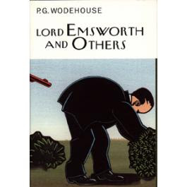
However, I was initially confounded by the choice of controversial Surrealist/Expressionist Polish poster artist Andrzej Klimowski as cover illustrator for these jaunty tomes. Surely Marc Rosenthal's expressive, cheery, flat-colored illustrations were far more suited to the environs of Blandings Castle! Everything about Wodehouse should be clean, orderly, pleasant and gentle. Klimowski's illustrations, by contrast, are thick-edged, roughly-hewn and garishly colored.


(And sometimes they're just downright ugly as in this cover for Girl On The Boat.)


Upon reflection, however, I realized that the style adopted for these book covers is not without legitimate artistic progenitors. Take a gander at this John Held, Jr. illustration circa 1925:


Also, why operate under the assumption that Wodehouse should have a visual stamp of pastel order? Wodehousian characters are nothing if not ceaselessly imperiled, escaping certain aunt-orchestrated-death or appalling matrimonial entanglements only by the skin of their teeth. I imagine were I to ask Bertie Wooster who should illustrate his life story he would nominate Caravaggio.

Finally, it occurs to me that, were the cover art 'prettier' it wouldn't be nearly so funny:

Wednesday, March 17, 2010

The Power. The Passion. The Corner.

This has nothing whatever to do with design, but it amuses me and... well, who the heck’s blog is this anyway??

It all began when I was listening to RadioDerb over at NRO and it suddenly struck me that John Derbyshire and John Cleese are basically the same person. (I am entertaining dark suspicions about witness protection programs and time travel…)

This naturally led to my musing about the leading roles in ‘NRO: The Movie’ (tagline: The Power. The Passion. The Corner.) Here is our all-star cast:

John Derbyshire ... John Cleese
William F. Buckley ... Christopher Walken
Rich Lowry ... Steve Carell
KLo ... JLo
Ramesh Ponnuru ... M. Night Shaymalan
(He could also pinch-hit as director, introducing a surprise ending in which it is revealed that Christopher 'Damn Fool' Buckley has, indeed, been possessed by pod people. Not much of a surprise, really...)
Jonah Goldberg ... Philip Seymour Hoffman
(But, in Seymour Hoffman's cute ‘State & Main’ days, not in his ‘gotta-prove-I’m-a-credible-indie-actor-so-I’ll-be-in-rubbish-like-‘The-Savages’ days.)
Victor Davis Hanson ... I have never felt the death of Millard Mitchell more keenly than at this moment…

The Brilliant and Sexy Mark Steyn shall, of course, play himself.

Please feel free to add your own on-the-nose casting to this inspired and definitive list.

(As a nod to the design-orientation of this blog I will note that the cover of John Derbyshire's book is both hilarious and depressing.)

Saturday, March 13, 2010

Consenting To Dream

An artist is a dreamer consenting to dream of the actual world. - George Santayana

Ruben Toledo's cover illustrations almost make me want to read these crashing bores. ("...if all else remained, and he were annihilated, the universe would turn to a mighty stranger..." Rubbish.)


Oh, what spellbinding phantasmagoria he could work with a Flannery O'Connor book cover!

Tangentially, Ruben and his wife Isabel have the coolest apartment ever. It's like a cross between the Mad Hatter's tea party and the disjecta membra of Salvador Dali.

(Huzzahs for Genna -- who has the best blog ever -- for inspiring this post!)

Wednesday, March 3, 2010

The Exploding Girl

It's not what you look at that matters, it's what you see. - Henry David Thoreau


I first caught sight of this poster design in a Google thumbnail -- and even in that small, pixelated space I was awestruck by the perfect arrangement of these elements. The sensitive placement of the title is particularly lovely. The rounded corners of the frame give the viewer the feeling of looking in on this girl through a viewfinder.

Everything speaks to the profundity of everyday intimacy.

(I can always tell a good design by the way it can move me to absurdly faux-poetic prose.)

Wednesday, February 24, 2010

"...there is in London all that life can afford."

Maybe I will go to London this year. I left my heart there and it is lonely without me...

Monday, February 22, 2010

The Simplicity of the Spheniscidae

Any intelligent fool can make things bigger, more complex, and more violent. It takes a touch of genius—and a lot of courage—to move in the opposite direction. - E. F. Schumacker

I can't get enough of Classic Penguin book covers which owe much of the genius of their simplicity to the orderly mind of Jan Tschichold. (Thanks to him, I absolutely rely on the Van de Graaf canon when laying out book interiors. It never lets me down.)

I also can't get enough of online shopping. (Honestly. Someone should stage an intervention.)

Imagine my exultation, therefore, at discovering THIS! I'll have one of everything, please! (Except, of course, the remarkable board game. Apparently they don't ship it to the USA. Communists.)

However, despite my loyalty to the Tschichold covers I am absolutely (albeit heretically) besotted by this new Ruben Toledo 'Penguin Classics Deluxe Edition' cover of Pride and Prejudice. I have a bazillion copies of this book but I might have to make it a bazillion-and-one...

Friday, February 19, 2010

'How To Be A Gentleman of Leisure'...


These cartoon sketches are as old as the hills, but I thought they might constitute a good inaugural posting for this design-oriented blog. It's an attempt to capture that Wodehousian fantasy... those halcyon days in the 1920s that I wish I had enjoyed.

Also, argyle rocks.

My original conception for this project was that the illustrations be designed into a two-page 'instructional booklet' for the aspiring gentleman of leisure. Like so: